Beyond just a little piece of paper with your contact details, a real estate business card is much more. It functions as a tiny billboard that promotes your abilities, expertise, and services. It is what you leave behind when you shake hands after a meeting or event. It would be the first impression you give! This is why you should be cautious of its design, layout, and content.
A well-designed business card functions as a powerful, versatile marketing material that makes a big difference to your professional status. This blog post aims to explain all the important design tips you must consider when creating a real estate business card. Keep reading to understand the magic of a perfectly designed business card.
Read More: How to Make a Real Estate Business Card Stand Out in a Crowded Market?
Real Estate Business Card Design Essentials
Creating a top-notch business card isn’t rocket science, and yet it is an art of its own. So, let’s explore the essential tricks and tips on how to design the best real estate business cards. Get ready to take your networking game to the next level!
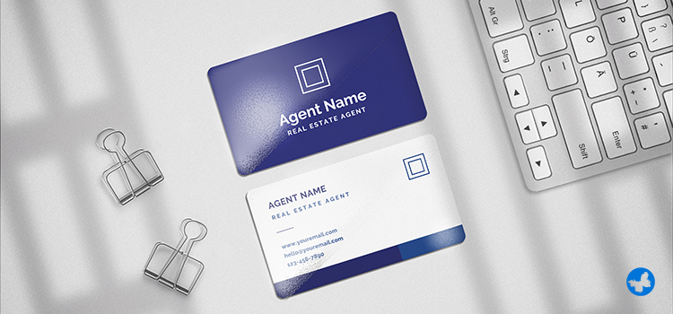
Include Contact Details
Since there is only a tiny space available, you need to decide on the information that should be included in your cards. To avoid struggling with space, only the necessary information should be included. These days, almost every business has a website, email address, fax number, mobile number, social media handles, and other ways of contacting them. In addition to contact information, your business card design must prominently represent your name and surname, job title, and the logo and name of the company.
Read More: What Information to Put on a Professional Business Card?
Use High-Quality Images
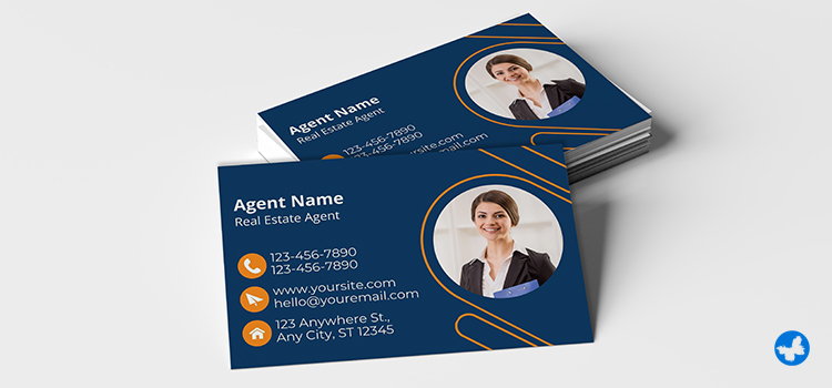
The professionalism and attention to detail conveyed by high-resolution photos can have a favourable impact on how prospective customers view your company. In particular, if the card is pertinent to your business, a visually appealing card with a high-quality image is more likely to be remembered than a generic one. Your business card can stand out and reinforce the identity of your brand with a carefully selected, superior image.
Significance of Colour Scheme
The use of colour in business cards is more than just for attraction. Colours have meanings and can convey feelings and messages subconsciously. For example, cool colours like blue and green often suggest trust and calm, while vibrant colours like red and orange signal energy and passion. Choose colours that complement your brand and the message you want to send.
Because CMYK inks are used by printing presses to produce colour, designing your business card in this style guarantees that the colours you see on your screen will be faithfully reproduced on the printed page. Additionally, the text and photos on your business card will be sharp and clear with 300 DPI, free of pixelation or blur. Be careful, since a business card with a low DPI (such as 72 or 96) will appear pixelated and grainy, giving it an awkward appearance.
Read More: The Science of Colours: What Works Best for Real Estate Print Marketing?
A Call to Action Adds Punch
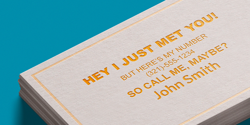
Just like a good advertisement, your business card benefits from a clear call to action (CTA). It doesn’t have to be complicated. A good CTA can guide the recipient towards the next step, making your card more interactive. You can act innovatively by offering special discounts or inviting readers to a free consultation session considerably increases the marketing value of your cards.
Think of a clear, actionable call to action to tell the prospects where to go and what to do next. Start your statement with action words such as “read,” “call,” “contact,” “visit,” etc. Use words like “right now,” “today,” “within the next 72 hours,” etc., to create a sense of urgency. At last, tell your prospects what’s in it for them if they do as they are told.
Put a Personal QR Code
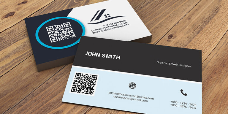
It is a wise, smashing idea to create a QR code for yourself and put it on your business cards. You can’t insert all the details into the small card space. Having a QR code, however, is a great and easy solution to give plenty of company information to the prospects without cluttering the cards. Moreover, your clients can add your contact information to their smartphones without bothering themselves to type it.
Add Stunning Visuals
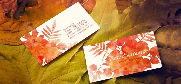
As a rule of thumb, the text, including the company’s primary and contact information, appears on one side of the card. So you can use the other side of the card to add subtle visuals. Remember that impressive visuals speak louder than hundreds of words. Choose visuals that enhance your professional look and lend credence to the quality of the products or services you offer. Bright, vivid, and contrasting colours make the cards instantly stand out to the prospects.
Follow the Basic Principles
As the first step, it is worth mentioning that, like any other printed material, you should follow the most basic principles for business card design. For example, all key information must be kept at least 5 mm from the trim edges of the cards. You will also find the pixel measurements useful if you are creating your business card with a design program or using software. Remember the card’s actual dimensions are 1050 x 600 pixels, its full bleed size is 1083 x 633 pixels, and its safe printing area is 1008 x 558 pixels.
Then, decide on the contents of your business card. Giving clients all the information they require about your company is the goal of a business card. Your name, title, phone number, physical address, website, email, social media accounts, business name, logo, and more are all included in this. Establishing the hierarchy of these details is something else you should do. Which item should be placed on top? Which one must have the biggest font?
Read More: Safe Zone, Trim, and Bleed Lines in Printing: A Simple Guide to Design Concepts
Expert Design Tips for Real Estate Business Cards
Understand Your Brand
Start by understanding your brand well. If you work for an agency, you likely need to adhere to the company’s brand image and guidelines. If you work independently, sit down and figure out what makes you unique.
Perhaps you specialize in property investments or historic houses. Or maybe you’re known for quick closes. Whatever your value proposition is, your business card should communicate it. This may not be as a text but could be through colours, fonts, or logos.
Read More: Branded Printing for Real Estate: Why It Can’t Be From Just Anywhere
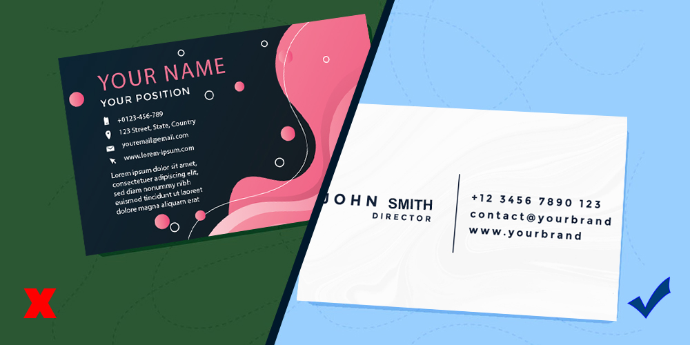
Simplicity is Beautiful
In the world of business cards, less is more. Sometimes, a colourless, simple style is more elegant and preferable for a sophisticated or specialized business than a colourful business card design with many images. Minimal designs also give adequate space for important information to appear prominently and grab attention.
An overloaded card can look messy and be confusing to the recipient. Your card must contain essential information such as your name, phone number, email address, and website URL. Including your professional title and business address might be necessary according to your business nature. Limiting the information keeps your card uncluttered and highlights the most critical data.
Read More: The Do’s and Don’ts of Real Estate Business Cards
Make It Legible
Real estate business cards are essentially designed to quickly share contact information with prospects. Avoid using smaller font sizes to include more details. This makes your card difficult to read at first glance. Moreover, very small font sizes may make the letters look messy after printing.
Remember that business cards are business cards—not booklets or brochures. Avoid overcrowding the design with a lot of information. This makes it look disorganized, illegible, and eventually useless. People usually don’t read wordy business cards. To make your brand name easy to recall, just include the necessary information.
Don’t Forget the Back
The back side of the business card is often neglected. You can use that space! You can list your services, include customer testimonials, or add a mini-map of your location. Remember, a business card is an opportunity to be creative and unique. Design yours to reflect your personal style and brand voice. Make it memorable, and people are more likely to hold onto it!
Be Consistent with Other Brand Materials
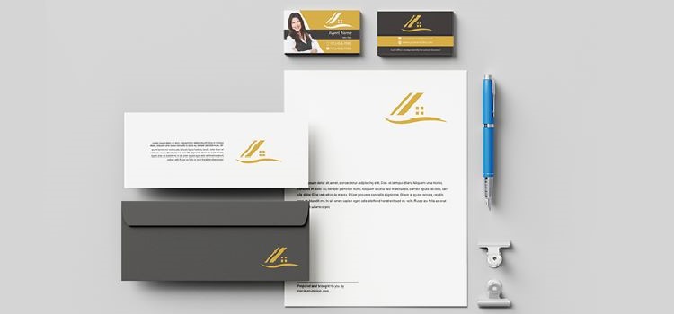
Consistently plays a vital role in branding. Generally, people recognize and remember a brand with its logo, colour scheme, typography and other visual brand elements. The potential customers recall a brand’s name through repetition.
Since these factors are the fundamentals of the brand identity, they must prominently appear in the layout and style of your business card design. Representing your brand in a consistent fashion will improve brand familiarity among people and increase your revenue.
Decide on the Best Shape and Size
Before starting to design, decide on the size and shape of your business cards to know what font size is appropriate for your purposes and how much information can be included on the cards. Horizontal rectangular cards are the most common orientation used. If standing out is important for you, you can choose vertical cards to appear differently. Also, using innovative shapes like circles, ellipses, or any shapes that are directly associated with your products or services or convey the quality of your business, instead of classic shapes, can give your brand a sense of uniqueness and professionalism.
Read More: Why Rounded Corner Business Cards Are a Smart Choice for Realtors in Canada?
Select Appropriate Fonts
Whether you choose classical serif styles or creative designer letter sets, the fonts talk more than words about your professional identity. Generally, it is recommended to select three sizes to build a hierarchy when putting the text. The font size and style of the fonts highly influence the appearance and readability of your cards. Avoid using too small font sizes – not everybody has perfect 20/20 vision. You can verify size appropriateness by asking friends or coworkers if they have no trouble reading the text.
Choose the Right Style

The most important factor to think about is what style really lends itself to your business. A plain and simple business card design or a design laden with colours? The selected colours and design should be associated with your business industry.
Pick the style that nicely represents the products or services you offer. If you are not sure which style fits you best, study various business cards from the same industry or check the cards of your competitors. Remember that you do not need to duplicate their ideas—the style you choose is supposed to differentiate your business from the rest.
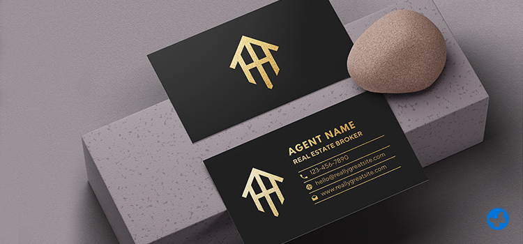
Use High-end Materials
Though business cards are traditionally printed on card stock, creative use of less-tried materials like plastic, metal, wood, etc., in combination with card stock gives an out-of-the-ordinary appearance to your cards that even interests picky clients. Furthermore, most people associate the quality of the business cards with the reliability of a brand. So don’t put your professional identity at stake with cheap materials.
Do the Final Check
Once you are done with your design, proofread it carefully and correct mechanical errors like spelling mistakes or incorrect contact information. Ask a friend or, if possible, consult an expert to see whether the wording is appropriate and clear, the font is legible, and the visuals are impressive and pertinent. You do not intend to damage a prospective business opportunity, do you? So, before sending your design to be printed, make sure that there are no unnoticed errors.
Final Tips Before You Print
Appropriate Data Placement
This is at the top of the list of the most frequent mistakes to avoid when designing a business card. Don’t place the most important information on your cards in such a way that people find it either too disorganized or too confusing. To make it easier for the prospects to read and respond to your marketing message, it is highly recommended to follow a standard pattern for data placement. Generally, the information is put on a business card design in the following order: name and surname, job title, company, and contact information.
Choose the Right Size, Shape, and Material
People usually keep business cards in their wallets or cardholders for a long time. Oversized cards, however, are more likely to end up in the trash bin because most people may find these annoying, unfriendly, and useless. The standard 3.5 by 2-inch business cards are still a great choice.
You may be on a limited budget and want to save a little money on your cards. But remember that using cheap, thin cardstock is often taken as poor and unreliable service. If you want to build trust and loyalty with your clients, consider printing your cards on paper with appropriate thickness. Otherwise, it will send just a message to recipients, “I don’t care about the quality.”
Be Careful About Colour Schemes
Colour choices are so important that they can make or break your business cards. You need to understand how colours work together before starting to design, or the balance of your business card design may be negatively affected. Avoid using colour schemes that are irrelevant to your brand or clash with your business industry, or colour contrasts that make the business card design uncomfortable to look at. Cheesy and unprofessional colour pairings should also be avoided.
Unique Selling Proposition
A very important part of a marketing campaign is informing customers about how a brand is superior to its business rivals. If your business card does not include a Unique Selling Proposition, you will lose the chance of using its full marketing potential. You must give at least one convincing reason to your customers why they should do business with you. A good Unique Selling Proposition defines the company’s premise, explains the problems you solve for your target audience, and lists the top benefits the prospects get from doing business with you.
Go to Professional Printers
No matter how perfect and creative your business card design is, second-rate printing on poor-quality card stock will let down your project. You may prefer to use ready-to-use design layouts or cheap printers, but this will not help you in the highly competitive real estate industry. If the printing is not done by an expert printer or with the appropriate equipment, the final print may come out distorted. To avoid this from happening, take your project to a professional printer.
Final Words
A well-designed business card can speak louder than words. It can reinforce your brand, create a positive impression, and even prompt referrals. By following the above-mentioned tips, you’re on your way to designing a standout business card that resonates with your real estate brand and services. With AgentPrint.com‘s user-friendly design tools, creating your stellar business card is a simple and enjoyable experience. You can choose your desired template and easily customize it after consulting with our professional design team. No graphic design experience is needed—we promise!