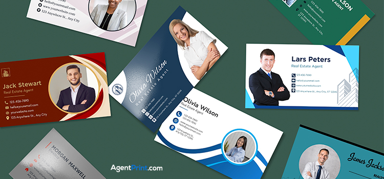
Fonts like Garamond, Helvetica, and Montserrat do way more than fill space on a real estate business cards : they present your professionalism and determine how quickly your brand message gets conveyed. This guide covers which fonts work best for real estate agents, plus how to size and pair them to stand out.
Your Business Card Is Your Brand
Brand fonts aren’t only aesthetically pleasing; they have a major impact on how people perceive your identity. From chic and trendy to classic and simple, each font has its own personality that shapes how a client sees your brand before they’ve read a word. Fonts convey feelings the same way colours do: friendliness, luxury, experience, and so on. This is why an overly informal or decorative font choice can quietly undercut your credibility.
Real estate is all about communication, trust, and relationships, so if you want to stay in a client’s mind, your font choice matters more than you’d think.
Here are the fonts real estate agents most commonly choose for their business card design methods.
The Classic and Authentic Fonts
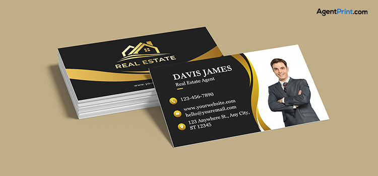
For real estate agents building a classic, strong brand identity, these two fonts are very practical:
- Garamond : A classic serif with a long history, Garamond conveys expertise and authenticity. Its delicate curves and balanced letterforms give a sense of sophistication that suits luxury real estate especially well. It works for both headlines and body text
Best for: Agents targeting a luxury or high-end market.
- Georgia: This font stays legible even at small sizes, which means your contact details are easy to read at a glance. It’s a more modern, polished alternative to the overused, sometimes stiff Times New Roman.
Best for: Agents who want a classic feel without looking old-fashioned.
The Modern and Professional Fonts
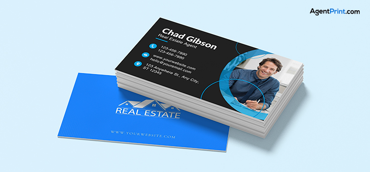
The Modern and Professional Fonts
If you’re going for a minimal, contemporary look, these two fonts create a sleek, professional feel.
- Helvetica: Clean, simple letterforms keep Helvetica easy to read even at small sizes, which matters since clients need to understand your information quickly. Its timeless, no-frills design also reads as credible and trustworthy rather than trying too hard.
Best for: Agents who want a clean, no-nonsense brand.
- Lato: Lato balances strong structure with rounded forms. This gives it a friendly, approachable feel without sacrificing readability. It’s adaptable enough to look both efficient and attractive, which suits a modern real estate brand.
Best for: Agents who want to come across as approachable and easy to work with.
The Bold and Memorable Fonts
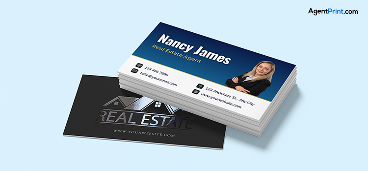
If you want your business card to stand out and stick in a client’s mind, these two fonts bring about the distinctive edge you desire.
- Montserrat: Available in weights from light to bold, Montserrat gives you enough room to create layouts that draw attention to specific details on the card. This font is inspired by the typography found on old signs in Buenos Aires’s Montserrat neighbourhood, and it carries a distinct urban charm that adds real personality to your brand. Its slightly condensed uppercase letterforms also make good use of a card’s limited space.
Best for: Agents who want their brand to feel different and a little unconventional.
- Oswald: Trust and dependability are essential in real estate, and Oswald’s tall, compact letterforms convey a sense of authority that reinforces that. It stays readable even at smaller sizes, so your contact details won’t get lost.
Best for: Agents who want to project confidence and authority.
Read more: What Information to Put on a Professional Real Estate Business Card?
Real Estate Business Card Font Size and Weight
The fonts you choose for your brand should look great at every size. Make sure they’re easy to read and visually appealing across different settings, including printed brochures and mobile screens. A font that looks clean in a large headline doesn’t always look good in smaller text, so to keep a clear hierarchy, use 10-16 pt for the most important information (your name or brokerage) and 8-12 pt for less prominent contact details.
Make your name or brand the clear focal point with a bold weight (700-900, Bold to Black). For details like phone numbers and emails, use a medium weight (500-600, Medium to SemiBold) so they’re readable without competing for attention. Smaller, less important text can use a lighter weight (300-400, Light to Regular) to stay visually balanced without cluttering the card.
One more thing worth keeping in mind: reverse text (light-coloured fonts on a dark background) needs a bolder weight or a larger size to stay readable, while positive text (dark-coloured fonts on a light background) can hold up well even at smaller
Pro Tips for Real Estate Business Card Fonts

A few more things worth keeping in mind as you finalize your card’s fonts:
- Golden Rule of Font Pairing: Stick to two fonts, one for your name and logo, and a clean, simple font for your contact information. This keeps a clear visual hierarchy and contrast without the card becoming cluttered.
- Consistent Fonts Across Platforms: Your branding includes email, print, social media, and your website, so choose fonts that are useful everywhere. Test them on both screen and print, since fonts don’t render the same way across different platforms. Consistency in your fonts makes your brand more memorable.
- Readability Comes First: If a client can’t quickly read your card, they can’t easily reach you. This is a lost opportunity, not just a design mistake. A clear, well-designed card is a sign of credibility.
- Everything Else Matters Too: Font is just one part of the picture. Audience, industry, brand colour, size, spacing, and white space all work together to keep your card clean and easy to read.
Read more: Top Benefits of Business Cards for Realtors
Putting Fonts to Work for Your Brand
Your business card’s font says something about your brand even before a client reads it. Choosing the right font helps your card stay readable while representing your brokerage the way you actually want. When you’re ready to bring your fonts to life, AgentPrint.com’s business cards are printed with the readability and consistency your brand deserves.
FAQ
What is the best font for real estate business cards?
It depends on your brand. Garamond and Georgia create a classic, established feel; Helvetica and Lato work well for a modern, approachable brand; Montserrat and Oswald stand out if you want something bold and distinctive.
Should I use serif or sans-serif?
Serif fonts like Garamond and Georgia tend to read as classic and established, while sans-serif fonts like Helvetica and Lato feel more modern and clean. Neither is objectively better; the right choice depends on the brand identity you want to create.
What font size is readable on a business card?
For your name or brokerage, 10-16 pt keeps it bold and easy to read. For contact details like phone and email, 8-12 pt is small enough to stay secondary without becoming hard to read.