
It is crucial to leave a lasting impression in the fast-paced real estate industry. The tangible appeal of a well-designed real estate flyer layout is still a very effective tool, even though digital marketing now controls a large portion of the market. But what actually makes a flyer effective? It usually depends on just one important component: its layout.
AgentPrint.com is going to help you and share its experience with you to create the best marketing materials for your real estate business. Keep reading to learn how to choose the right real estate flyer layout to achieve the best marketing results.
Read More: What Is the Difference Between Digital Marketing and Print Marketing?
Why Flyer Layout Matters in Real Estate Marketing?
Real estate flyers can be thought of as your property’s little billboard. Your flyer must quickly capture attention and effectively communicate its message, just like a physical billboard. An effective flyer layout aims to direct the viewer’s eye, highlight important information, and eventually pique interest and questions. It is not just about beautiful design. A flyer with a professional, readable layout can secure viewings and generate leads, while one that is messy, disorganized, or poorly designed is likely to end up in the trash.
Key Elements of an Effective Real Estate Flyer Layout
Let’s first discuss the essential elements of any successful real estate flyer and how their positioning affects the overall design before getting into particular layout types:
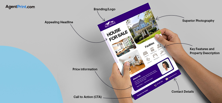
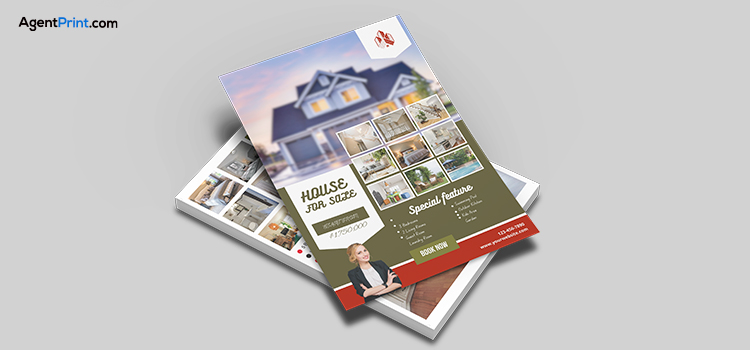
- Appealing Headline/Property Address: This is what people see right away. It must be noticeable, unambiguous, and instantly communicate the flyer’s purpose.
- Superior Photography: The visual aspect of real estate is paramount. Use gorgeous, expertly taken pictures to highlight the property. The flyer’s layout should let these pictures shine and serve as the main attraction.
- Key Features and Property Description: Use brief, interesting paragraphs or bullet points that highlight the property’s salient features (e.g., square footage, number of bedrooms/bathrooms, and special amenities).
- Price information: The price details should be easily accessible and clearly displayed.
- Contact Details: Your flyer must include your name, website, phone number, email address, and agency. Make it simple to get in touch with you.
- Call to Action (CTA): What is the next action you want people to take? You can use “Visit our open house,” “Call for a showing,” or “Learn more online.”
- Branding/Logo: Professionalism and memorability are reinforced by your agency’s logo and consistent branding.
How well your message is understood will depend on how these components are positioned and sized within the layout you have selected.
Read More: Design Engaging Real Estate Flyers with 8 Golden Tips
Choosing the Right Layout Based on Property Type
When it comes to real estate marketing, the “one size fits all” strategy rarely works. Depending on the kind of property you’re exhibiting, the best flyer layout may vary.
Single-Family Homes Flyers
The ideal layout for single-family homes is frequently one that prioritizes space and lifestyle.
- Concentrate on a high-quality image: An eye-catching, sizable exterior shot can grab attention right away.
- Several interior shots: Showcase different rooms using a grid or column arrangement, emphasizing elements like kitchens, living rooms, or master bedrooms.
- Clear floor plan integration: This is an optional but effective item. A concise, easily readable floor plan can offer important information.
- Dedicated area for unique selling points: Make sure to draw attention to any features that make the house stand out, such as a large yard, a remodelled kitchen, or smart home capabilities.
Condos Flyers
Layouts that prioritize amenities, location, and effective use of space are frequently advantageous for condos.
- Lifestyle photography: Highlight the neighbourhood and the building’s features (gym, pool, and rooftop access).
- Compact design: A neat, well-organized layout with more icons and bullet points and less text can work well given the possibly smaller square footage.
- Prominence of the floor plan: For smaller apartments, a thorough floor plan may be essential to help potential purchasers picture the area.
- Highlighting community features: Use clear language or images to draw attention to the building’s lively community.
Luxury Properties Flyers
 Elegance and sophistication are necessities for luxury. This exclusivity should be reflected in the layouts of upscale properties.
- Minimalist design: White space and less clutter are hallmarks of minimalist design. Let the property’s quality do the talking.
- Large, high-resolution photos: Emphasize architectural details, luxurious finishes, and expansive views in your flyer layout. Examine expertly taken pictures that perfectly convey the essence of luxury.
- Superior quality paper and print: I know this is not related to layout, but believe me, this will absolutely enhance the stunning look of your flyer.
- Curated text: Highlight special features, distinctive materials, and upscale amenities while using elegant language.
- Subtle branding: The elegant design should be complemented by your logo, which should be present but not overbearing.
Open House Flyers
The purpose of open house flyers is very clear: to quickly convey important information and motivate prompt action.
- Clearly visible “Open House” headline: This title should be set in the best position and font to make it hard to miss.
- Clear date and time: This data needs to be easily available.
- Address and direction: Make sure the address and directions are correct and simple to follow.
- Key selling points (briefly): Using a few bullet points, explain the attraction’s benefits (e.g., “Stunning city views,” “Recently renovated”).
- Your contact information: These are important items for questions or follow-ups.
Commercial Properties Flyers
Commercial real estate flyer layouts should be extremely professional and educational, focusing on business requirements rather than individual preferences.
- Numbers and details: Include parking area, accessibility, zoning, permitted uses, square footage, and potential revenue.
- Detailed site maps and floor plans: Such information is necessary to comprehend the property’s use.
- Benefits of the location: Emphasize how close it is to main thoroughfares, public transportation, business areas, and facilities necessary for commercial operations.
- Top-notch exterior photos: Display the building’s exterior and general appearance.
- Financial information: Sale price, lease rates, and any other pertinent financial data are important.
- Simple and professional design: Stay away from busy or excessively imaginative layouts.
Real Estate Flyer Layout Examples That Work
 Although particular parts may vary depending on design trends, layouts that work for everyone usually have the following traits in common:
- The “Z” Pattern: When reading a page, readers instinctively trace a “Z” shape. Put your most crucial components (headline, main image, and call to action) based on this pattern.
- Grid-Based Layouts: Offer balance and structure, which facilitates element alignment and produces a clean aesthetic.
- One primary image with supplementary information: Put a big, eye-catching image at the top, with well-structured text and smaller images underneath.
- Two-Column Layouts: Such layouts are useful for comparing features or separating contact information from property details.
Read More: An All-Inclusive Guide to Flyer Dimensions and Size Options
Common Mistakes in Real Estate Flyer Layouts
The effectiveness of your flyer can be greatly increased by avoiding these mistakes:
- Too Much Clutter: The flyer becomes overwhelming and challenging to read when it is overloaded with text and images.
- Low-quality images: Unprofessional, dark, or blurry images are a big turn-off.
- Inconsistent Branding: Your marketing materials lose their professionalism if they don’t have a consistent appearance.
- Illegible Fonts: Select readable, unambiguous fonts. Don’t use tiny or excessively ornamental typefaces.
- Lack of White Space: White space is essential for readability and establishing a sense of openness.
- Unavailable or Difficult to Locate Contact Details: Ultimately, you want people to get in touch with you, so make it simple!
- Ineffective or Nonexistent Call to Action: Describe what you would like people to do next.
Final Words
In the fiercely competitive Canadian real estate market, every little detail counts. Flyer layouts that are carefully considered and executed are strategic marketing choices rather than merely personal preferences. You can make real estate flyer layouts that not only draw attention but also produce results by knowing the fundamentals of effective design, customizing your layout for the type of property, and steering clear of typical blunders.
Invest in quality design, and you’ll see your print products grow into effective real estate marketing tools. AgentPrint.com offers expertly designed and printed real estate flyer layouts to guarantee your success. To get the desired outcome, choose the best.