
A variety of print marketing materials are available to real estate agents for their advertising needs. If the print quality of the tools you use for marketing is poor, the quantity and variety of them may be pointless. Print-ready files are the best way to guarantee a seamless transformation of your print files to a high-quality final product. The key to successful printing is pre-press!
This blog post will walk real estate agents through the process of creating a flawless print file and outline all the necessary pre-press procedures. We’ll go over the design and images, the content restrictions and guidelines, and the file preparation. Keep reading to learn and be fully prepared!
Why Pre-Press Matters in Real Estate Printing?
In real estate printing, pre-press is an essential step since it guarantees the precision, effectiveness, and quality of the finished printed product, such as flyers, postcards, and brochures. Without good pre-press, even the most exquisitely designed materials may contain numerous mistakes, wasting money and giving the property or agency a bad impression.
Pre-press is essential for quality control, high efficiency, cost savings, and showing your skills as a professional real estate agent. Pre-press is essentially the cornerstone of profitable real estate printing. It is the crucial stage to turn digital designs into real, superior marketing collateral that successfully advertises properties and enhances brand recognition.
Your Step-by-Step Print Checklist Before Submitting Files
Real estate agents must make sure print files for their marketing tools are ready before submitting them. Some of the main things they can do include verifying the file format, colour mode, image resolution, bleeds, proofreading, and font embedding. The following checklist will guarantee the high quality of the final print product, which also helps prevent common printing errors and overpaying for a reprint.
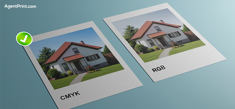
Use CMYK Colour Mode
The colour model used in printing is called CMYK. It is an acronym for cyan, magenta, yellow, and key (most often black). A vast array of colours can be produced in printed materials by combining these four ink colours.
In a process called subtractive mixing, CMYK colours are mixed to varying degrees using physical ink on a printing press to produce images. So, the CMYK colour profile should be used for any design that will be printed on paper. It is advised to use the CMYK colour scheme to avoid any colour shifts and make sure of proper colour representation on paper.
Conduct Screen Calibration
It’s crucial to calibrate your screens before printing to preserve colour accuracy. The true tone of your colours can be greatly affected by an inaccurate screen, resulting in differences between what you see on the screen and the printed output.
Graphic designers and photographers have access to various tools that help ensure the colour accuracy of their images before sending the design to print. Screen calibration reduces the possibility of misprints and can save you a lot of money by ensuring that the colours you see are as close to reality as possible.
Frequent screen calibration is a proactive measure that guarantees your design intent is accurately reflected in the final printed materials and helps maintain consistency in colour representation.
Bleed and Safe Zones Are a Must
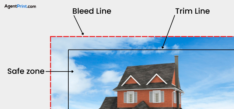
Achieving printed materials that are accurate, clean, and professional requires the use of bleed lines and safe zones in pre-print design. If you want to avoid white borders caused by minute paper shifts during cutting, bleeding guarantees that colours or images reach the very edge of the page.
On the other hand, the safe zone shields crucial components from unintentional cutting off, such as text and logos, by keeping them away from the trim line. Considering these two elements during pre-print will maintain the exact intended quality of your print products.
Read More: Safe Zone, Trim, and Bleed Lines in Printing: A Simple Guide to Design Concepts
Check Image Resolution
For printed materials like real estate booklets, posters, or magazine pages, it is essential to check the image resolution at 300 DPI (dots per inch). A 300 DPI image avoids the common problem of pixelation or blurriness that can arise with lower resolutions. This will safeguard sharpness, detail, and vibrant colours in the printed output.
DPI has a direct relationship with the size of the final print. So, if you enlarge a print project without considering the DPI, pixelation may occur. Your printed materials will look their best with vivid details and brilliant colours that faithfully capture your original design if you keep your images at 300 DPI.
Check the Fonts
Fonts for preprints should be outlined and embedded to ensure consistent display and avoid problems with font substitution when printing. Font substitution, which will destroy the layout, could be avoided by embedding to ensure a consistent display across various devices.
When it comes to logos, designs with particular artistic effects, or fonts that are challenging to embed, outlining ensures font appearance. Text is transformed into outlines (vector paths) through this process to guarantee proper display regardless of font availability. It usually comes last because it renders the text uneditable.
Read More: 10 Tips for Choosing the Right Fonts for Real Estate Signs
File Format
For pre-press, PDF/X-1a is advised since it enforces rigid file preparation guidelines, providing consistent printing. Many common printing problems, such as missing fonts, incorrect colour spaces, and transparency issues, are eliminated with this format.
You are effectively providing a “print-ready” file by following PDF/X-1a, which reduces the possibility of unforeseen outcomes during the production process. By standardizing these components, PDF/X-1a reduces the possibility of mistakes that may occur during printing.
Verify Trim Size and Final Dimensions

The final size of your printed item after cutting is known as the trim size. It is essential to confirm the final dimensions and trim size during prepress to ensure that your printed piece will look free of cropped content, unwanted white edges, and any misalignment.
The inaccurate trim setting could result in scaling or cropping problems because the print might not match the printer’s specifications or the intended paper size. Costly reprints and delays are avoided because it ensures that the finished product adheres to printing standards and matches your design.
Double-Check Spelling
Typographical errors and inaccurate information can undermine the real estate agents’ professionalism and the quality of print materials. If customers notice errors in the first place, they might start to doubt the accuracy of your other content.
Error-free, polished materials enhance your audience’s trust in you and your brand. An excellent final product that appropriately conveys your message and brand can be guaranteed by carefully reviewing your contact information and other data during prepress.
For your convenience, we have prepared a prepress checklist that you can use to ensure that everything is proceeding as planned. The PDF file is available for download here, and you can review each step you took afterward.
Mistakes Realtors Often Make Before Sending Files to Print
Achieving your marketing objectives and producing high-quality print materials depend heavily on the pre-press process. The most crucial actions you should take during this stage are those listed above. Here, we’ll discuss some common errors that real estate brokers make when submitting their print projects. Please avoid these mistakes:
- One of the most common errors is the use of images with low resolution, which will result in pixelation.
- Not considering the safe margin will result in removing some of the important information. This margin is different for each print marketing material; check the right size for your specific project.
- When you finish the file with inaccurate information, it gives the impression that you are careless and unprofessional. This could destroy all of your networking and marketing efforts.
- Not choosing a professional print company would make you disappointed. This is the last but most important choice that will directly affect the finished product.
Final Words
Those real estate agents who carefully take their steps in the designing and proofing phases are the winners. This is what makes you appear more professional while saving your time and money. After proofing every piece of info and modifying the colours and fonts, communicate with the printing company to ensure that everything will go as planned. AgentPrint.com has long-term experience working with real estate agents to print all their required print materials. Feel free to contact our experts and consult about your needs and specifics.