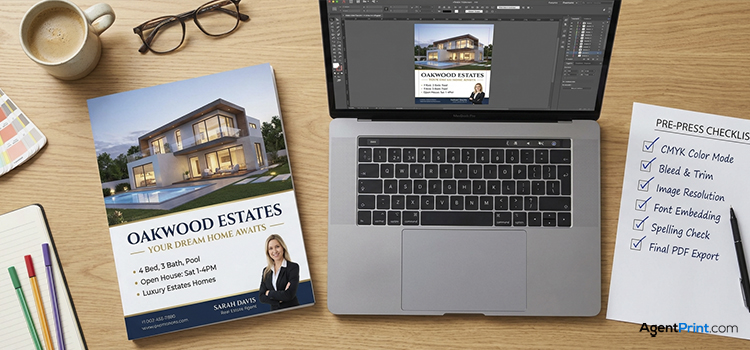
Have you ever scrolled through the MLS and spotted a listing featuring a “sinking living room” or recently “remolded bathrooms”? While a funny digital typo can be fixed in seconds, a printed mistake on a batch of open house print products is permanent and expensive. This print-ready checklist covers exactly how to prepare your files for production – from spelling checks and securing the right image resolution to checking your bleed lines – so you never waste money on a bad print run again.
Contents
Must-Dos for Print-Ready Files
Before you submit files for your next marketing campaign, run through this technical checklist. These steps ensure a smooth transition from your computer screen to the final physical product.
1. Double-Check Spelling and Accuracy
Those “sinking living rooms” and “remolded bathrooms” we mentioned earlier are funny on the internet, but a misspelled email address on a 500-piece postcard campaign is a disaster. Typographical errors undermine your professionalism instantly. Read your contact details out loud and ask someone else to review them before finalizing the file. Phone numbers and email addresses are the easiest errors to miss!
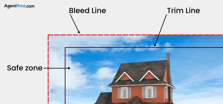
2. Respect the Bleed and Safe Zones
One of the most frequent problems our print team runs into is important text getting sliced off during the trimming process. To prevent this, keep all your critical details safely inside the “safe zone”, which is a comfortable margin away from the edge of the card. On the flip side, if your design has a background colour or photo, stretch it past the cutting line into the “bleed” area. This guarantees a seamless, edge-to-edge finish without any awkward white borders (at least 0.125″ bleed on each side, with larger projects possibly needing more, and text kept at least 0.25″ from the trim line).
If you need a refresher on how this works, read our guide about safe zone, trim, and bleed lines in printing.
3. Use CMYK Colour Mode
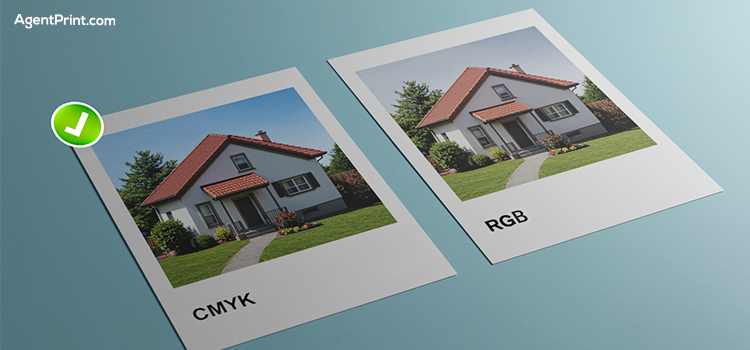
Computer screens and printers speak two different languages. Screens use RGB (red, green, blue) to display colours with light, while printing presses use CMYK (cyan, magenta, yellow, and black) ink. If you design your file in RGB, the colours might look muddy or completely different when printed. Always set your design software to CMYK colour mode to ensure predictable, accurate colours.
For black and white images, make sure they are in grayscale colour mode. For small black text to print crisply, it should be set to 100% K (black) only, rather than a mix of all four CMYK colours. Also, some Pantone shades may print slightly duller if converted to CMYK, so if your brokerage colours are critical, use their official CMYK values and request a hard copy proof, since screens can’t show the true printed colour.
4. Check Image Resolution
Images saved directly from listing sites, websites, or social media are usually too low in resolution for print. This results in blurry, pixelated photos that severely hurt your credibility. Always use the original, high-resolution files from your listing photographer, and make sure your images are set to at least 300 DPI at their final printed size. Also, double-check that you actually have the photographer’s permission to use the listing photos for print marketing.
5. Use Special Finishes Correctly
Spot UV and foil need two files, one for the artwork and one for the finish. The finish file must be a vector PDF in black and white, using solid 100% K where the finish goes, with no shadows, glows, or grayscale.
Another frequent mistake is applying specialty finishes incorrectly. For example, using raised foil on tiny, delicate details or very thin fonts is a recipe for disaster. The foil effect is much more impactful and prints significantly better on bold logos and larger text.
6. Ask for Proofs
It is highly recommended to ask for a digital or physical proof, as it catches most problems before printing and helps avoid costly reprints. Digital proofs are low resolution and show positioning, trim edges, and text accuracy, not final colour or print quality. A resolution problem triggers a warning on the proof so the file can be fixed, and a hard copy proof is available when colour accuracy is critical.
7. Use Vector Files for Logos and Graphics
The most common problem our production team sees from realtors is submitting artwork that isn’t in a vector format.
Vector files are built from lines and shapes rather than pixels, meaning they can be resized to any size without losing quality. A non-vector logo can look blurry or jagged when enlarged, so always try to upload your logos and simple graphics in a vector format to keep the edges razor-sharp.
Realtor-Specific Extras: Design, Layout, and Compliance
Beyond the technical file setup, there are a few real estate-specific details you need to verify before preparing your print materials for your marketing campaigns.
Keep it Simple and Professional
Don’t treat a small business card like a promotional flyer. It should only present who you are, what you do, and how to contact you. To make a strong first impression, you should avoid overcrowded designs, hard-to-read fonts, and flimsy materials that can unintentionally hurt your brand instead of supporting it. Read the Do’s and Don’ts of Real Estate Agent Business Cards to learn more about designing a card worth keeping.
Text and Readability
Never let your text drop below 7pt in size, and avoid using thin script fonts for crucial details like phone numbers and email addresses. If you are placing white or light text over a dark background, make the font slightly larger and bolder, as thin white strokes can sometimes fill in with ink during the printing process. For yard signs, make sure your name and number are large enough to be read clearly from a passing car.
Also, remember to flatten your layers and outline your fonts before saving your final PDF. If you don’t outline your fonts, the printer’s computer might substitute your elegant brand font for a default system font, completely destroying your layout.
QR Code Best Practices
QR codes are incredible tools, but some free QR code generator websites only host the link for a limited time. If the code isn’t paid for, the site might deactivate it, leaving you with useless marketing materials. Always test your code with multiple phones, check the generator’s terms, and ensure the code is printed large enough to scan easily (around 0.75″ to 1″ minimum). Pro tip: use a dynamic QR code so you can change the web destination later without having to reprint everything!
Layout and Timing
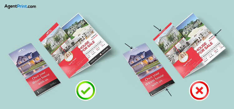
For double-sided items, check that the front and back are in the right orientation so one side isn’t upside down. If you are printing folded brochures, double-check where the folds actually fall. For instance, tri-fold panels are not all the exact same width, and you don’t want your text disappearing into a crease.
If you are ordering a custom-shaped print, your file will need a contour cut line to show where the product should be cut. Set it as a named spot colour (e.g. “CutContour”) on a separate layer, and ensure it’s one continuous line with no gaps or overlapping segments. If that sounds technical, our design team can set it up for you.
Finally, always allow enough time for proof review and
shipping before your listing launch so you aren’t rushing approvals at the last minute.
Final Words
Running through a pre-press checklist might feel like a chore, but taking those extra five minutes is the only way to guarantee your marketing materials look professional and arrive on time.
At AgentPrint.com, our ready-to-use design templates already have the correct size, bleed, and safe zones. Plus, you can request a digital print proof to catch any issues before production starts. Whenever you’re ready to create flawless marketing materials, explore our easy-to-customize, premium print products at AgentPrint.com.
Frequently Asked Questions
What is a print-ready file?
A print-ready file is a digital document formatted exactly to the printer’s specifications. This means the file is in the correct colour mode (CMYK), the images are high resolution (300 DPI), the fonts are outlined, and the dimensions include the proper bleed and safe zones so nothing gets cut off during production.
Why do I need CMYK for print?
Computer and phone screens use RGB (red, green, blue) light to create colours, while commercial printers use CMYK (cyan, magenta, yellow, and black) ink. Because ink cannot replicate the bright, glowing colours of a screen, designing your file in CMYK from the start ensures the colours you see on your monitor accurately match the final printed product.
What DPI should images be for printing?
All images should be at least 300 DPI at their final printed size. Using images with a lower DPI (like those saved directly from social media or standard websites) will result in blurry, pixelated, and unprofessional-looking prints.