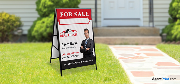
It may seem insignificant, but choosing a font for your real estate signs is crucial! The correct font can attract attention, effectively communicate your message, and make prospective customers feel good.
This guide will give you 10 easy tips to pick the perfect fonts for real estate signs. These tips will work for any sign, whether for a flyer, banner, or something else. They’ll help you choose a font that looks good with your brand, is easy to read, and makes people fascinated!
The Power of Fonts for Real Estate Signs
The writing on your real estate sign can make a big difference in its appearance and content! A proper font will make people recognize your brand and think of you as a professional.
There are many fonts to choose from, some bold and new, some classic and old-fashioned. The right font with branded colour will grab people’s attention and show them what kind of company you are. More importantly, it can help you sell a house! You can consider the following tips for choosing the right font for your real estate signs:
1. Understand Your Brand Identity
Picking a font for your real estate sign is like picking an outfit—it should match your style! Are you a new, trendy company or a more established one? Fonts can make people feel different things.
For a modern feel, fonts like Helvetica are simple and clean. If you want people to think you’re reliable, fonts like Times New Roman are a good choice. The most important thing is to pick a font that goes with your whole brand, so everything looks put together.

2. Prioritize Readability
Fonts on your real estate sign must be easy to read, no matter how fancy they look! People need to get your message fast. Consider the size of the letters and the distance at which people will be standing. Letters that look cool up close might appear blurry from a distance.
Studies show simple fonts like Arial are best. They’re clear and plain, even in bad light. So please keep it simple and clear, and people will see what you’re selling!
3. Consider Sign Placement and Size
Pick a font that works for your sign size. Big signs need bold, clear letters. Small signs can have thicker letters with more space between them. Select a font based on the size of your sign. Large signs require bold, readable fonts, while small signs should be thicker and separated by greater distances.
You must also think about the background colour and the light around the sign. Make sure the letters are easy to see; for example, a bright yellow font might be hard to read on a white background.
Read more: Tips for Effective Real Estate Sign Placement in Canada
4. Use Unique Fonts
While readability and consistency are crucial, you also want your real estate signs to be differentiated and leave a lasting impression on potential clients. Using distinctive fonts can help your signs stand out from the competition, draw attention, and leave a lasting impression on anyone who sees them.
It’s important to keep in mind that people still need to be able to read your sign quickly, even with the use of stylish fonts. Avoid using a font that is too complicated for anyone to read!
5. Modern Yet Timeless Balance

When choosing the best fonts for signs, it is crucial to create a balance between modern and timeless trends. While modern fonts can help your business appear innovative and on-trend, they may quickly become outdated as design trends evolve. On the other hand, timeless fonts will ensure that your signage remains relevant for years.
6. Match Fonts with Sign Purpose
Your real estate sign is the first thing your potential clients see. You must pick a font that matches the kind of house you’re selling and the people you’re trying to reach.
Imagine you’re selling a super fancy house. The font on your sign should be elegant and classy. Fonts like Didot or Baskerville can give that kind of feel. On the other hand, when you’re selling regular houses for young people, your sign should feel more modern and easy-going. Fonts like Helvetica or Futura are good choices for this. They’re clear and simple.
7. Pair fonts for Harmony
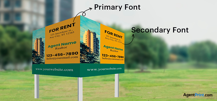
One font might not be enough to make your real estate sign super eye-catching. You can mix two fonts as long as they go well together! This can make your sign look more interesting and organized.
For example, you can pick a simple font for most of the writing and then use a fancier font for important parts, like the address or the price. You can mix fonts, or you can pick two fonts from the same family but in different weights (like bold and regular).

8. Test for Legibility
Before you pick the final font for your real estate signs, make sure people can read it easily! If people can’t read the sign without hesitation, you must pick a different font and try again! You want your sign to grab attention, but it also needs to be clear so people know what you’re selling.
Put the sign design on your screen and take a few steps back to see how readable it is. Make sure the text is still readable and recognizable from a distinct distance. The height of the letters should be at least 1 inch for every 30 feet. It implies that letters should be at least 3.3 inches tall if the sign is to be readable from a distance of 100 feet.
9. Consider Font Consistency
Keeping your fonts the same across all your real estate signs and marketing materials is important. It helps people recognize your brand easily. Picking one main font will be your brand’s “uniform.”
The important thing is to keep using the same fonts everywhere. This way, people will start to associate those fonts with your brand, and they’ll remember you better. So next time someone sees a sign with your fonts, they’ll instantly know you’re selling houses!

10. Seek Professional Advice
Don’t be afraid to call in the experts! Graphic designers and typographers understand fonts better than most people. They know what’s trendy, what’s easy to read, and even how fonts can influence people’s feelings.
Our design experts can give you advice specifically for your business, target audience, and the kind of houses you’re selling. AgentPrint.com can help you pick fonts that will make your print signs look sharp and get people interested in your listings.
Final Words
Choosing the right fonts for your real estate signs isn’t just about making them look pretty; it is a key part of your overall marketing strategy. The above-mentioned tips can help you create signs that are clear, eye-catching, and memorable. This will help you connect with potential buyers and ultimately sell more houses. Never underestimate the power of fonts for real estate signs in attracting attention and driving sales!
