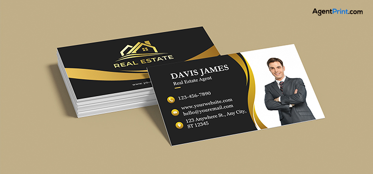
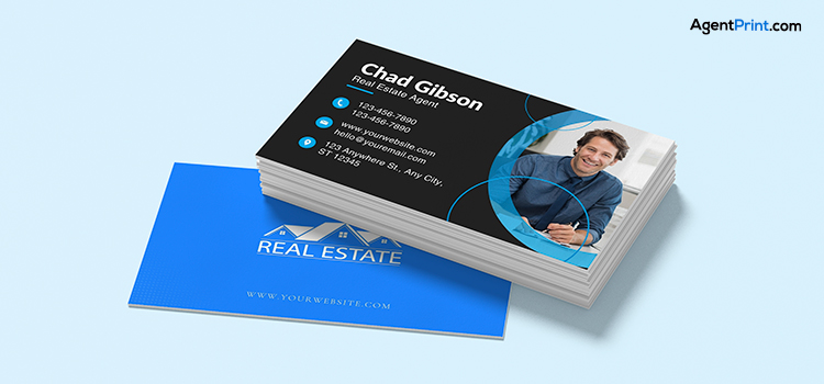
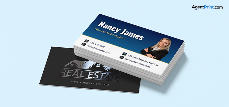
Although logos and colour schemes are important elements of personal branding for real estate agents, fonts are crucial in defining the professionalism, tone, and readability of your marketing materials. Choosing a suitable real estate business card font will leave a lasting impression and foster customer trust, while effectively promoting your brand’s message. So, you must choose the right font for real estate business cards because, as your tiny billboards, they have the vital task of making a good first impression.
This blog post explores the most common real estate business card fonts and offers important considerations for the best font size and weight. We hope this article can help you find the proper real estate business card font that perfectly matches your brand identity.
Your Business Card Is Your Brand
Not only are brand fonts aesthetically pleasing, but they also influence how people view your identity. From chic and trendy to classic and simple, each font has a distinct personality that can influence how customers perceive your brand. Fonts can convey friendliness or luxury in the same way that colours can convey the feeling of happiness or sadness. This is why if you choose an informal or very decorative font, it may compromise the credibility of your brand.
The real estate agent’s job is all about communicating and building trust and relationships. If your goal is to stick in your clients’ minds, one of the most important elements to consider is real estate business card fonts. Here are the most common fonts real estate agents usually use for the business card design.
The Classic and Authentic Fonts

For those agents who are looking for a classic and strong brand identity, the following fonts could be ideal.
- Garamond: This classic serif font has a long history and conveys a sense of expertise and authenticity, which is advantageous for real estate agents. For clients looking for luxury real estate, the font’s delicate curves and well-balanced letterforms convey a sense of sophistication and prestige. The best feature is that you can use this font for both headlines and body content. Garamond is a flexible choice for the various components of a real estate business card design.
- Georgia: Your contact details and branding will be easy to read on a business card thanks to Georgia’s legible letterforms and exceptional readability, even at small sizes. It provides a new, superior impression and is a sophisticated substitute for the overused and occasionally regarded as stiff Times New Roman.
The Modern and Professional Fonts

If you are looking for a minimal and contemporary vibe, these fonts are the best options to create a sleek design for your professional real estate business card.
- Helvetica: Even at smaller sizes, Helvetica is incredibly easy to read due to its distinctive, simplistic letterforms and smooth edges. Clients must be able to quickly understand the written information on a business card. Prospective clients are drawn to the font’s elegant, perfect design, which is conveyed by its simple, timeless design. Conveying credibility and transparency, this font helps build client trust.
- Lato: This font is a balanced combination of strong structure with rounded forms, conveying a friendly and inviting quality. In addition to providing excellent readability, its contemporary design fosters credibility and trust with prospective customers. Lato’s adaptability ensures that your business card is both efficient and attractive, making it appropriate for modern real estate brands.
The Bold and Memorable Fonts

The following fonts will provide a distinctive quality that will stick in clients’ minds if you want your real estate business card to be unique and memorable.
- Montserrat: This font is available in a variety of weights, ranging from light to bold, enabling creative and attractive layouts that draw attention to various informational elements on the card. Motivated by the typography found on signs in Buenos Aires’ Montserrat neighbourhood, the font has a distinct urban charm that can add a unique personality to your brand. A business card’s limited space can be effectively utilized with a clear design and slightly condensed uppercase letterforms of this font.
- Oswald: In the real estate industry, agents require creating trust and dependability. The tall and compact appearance of Oswald fonts can convey an image of authority. Contact information and other important details on your business card will be easy to read, even at smaller print sizes, thanks to Oswald’s functional and readable design.
Read more: What Information to Put on a Professional Real Estate Business Card?
Real Estate Business Card Font Size and Weight
The fonts used for your brand should look fantastic at different sizes. Make sure your brand fonts are readable and visually appealing in a variety of settings, including printed brochures and mobile screens. Sometimes, a font that appears professional and clear in a large headline might not be readable in smaller text. To guarantee a clear hierarchy, it is recommended to use 10–16 pt for the most important information, like your name or company, and 8–12 pt for less noticeable contact details.
The reader’s eye is guided by a clear visual hierarchy created by using contrasting weights to distinguish between the elements on your business card. Make your brand or name stand out as the most important piece of information by using a bold font weight (e.g., 700-800, Black) for maximum impact. For details like phone numbers and emails, use a regular or medium font weight (e.g., 400-600) so that they are readable without being too conspicuous. Smaller, less important text can be balanced visually by using a light or regular weight (e.g., 300-500) to create contrast and prevent clutter.
Pro Tips for Real Estate Business Card Fonts

After learning about the most common fonts usually applied for real estate business cards, let’s check the other important tips to keep in mind when designing a business card:
- Golden Rule of Font Pairing: Pair a bold font with a clean serif font, with a sans-serif font for your contact information and a different font for your name and logo. For a smooth, clean appearance, never use more than two font families. You should make sure the fonts provide visual hierarchy and contrast for better readability.
- Similar Fonts Across Platforms: Real estate branding includes email, printed materials, social media, and websites, so it’s important to choose brand fonts that look good across all platforms. It is crucial to test fonts on both digital and print media because not all fonts are platform-neutral. Brand consistency is a vital part of branding strategies, so it is important to use the same font for all marketing tools to be more memorable.
- Readability Must Be Your Top Priority: The main goal of real estate business cards is to give quick, easy-to-read information. If potential customers can’t quickly read your business card, they won’t be able to get in touch with you. This could result in lost opportunities and a damaged professional reputation. Never underestimate the power of a clear, well-designed card to convey a credible and professional image.
- Other Elements to Consider: When choosing real estate business card fonts, other elements are also important, including your audience, context, industry, and brand colour. So, keep in mind that the font is one small element of the overall design. Pay attention to the right font size and spacing for readability, an efficient layout, and white space to prevent clutter.
Read more: Top Benefits of Business Cards for Realtors
Final Words
Your real estate business card font talks about your brand. Brand fonts are essential in determining how customers view and relate to your brokerage in the fiercely competitive real estate industry. Your objective is to build a unified and powerful brand that appeals to customers by accurately representing your values using the right font. This will make sure your business cards are readable and perfectly present your brand. Working with a print company with long-term experience working with realtors and brokerages helps you be sure about the outstanding and consistent print marketing materials. Start your order from AgentPrint.com to guarantee the high quality and readability of your real estate business card fonts.
